The Project

RestWorld's target users are, on one side, busy restaurant owners/managers looking for staff and, on the other, waiters, cooks, and other candidates for the job.
From my UX research, it resulted that the restaurateurs are very stressed in general, and taking the time to read CVs, call, interview, and make a try with candidates is their biggest pain. More in detail, CVs were often unclear, unscannable, and incomplete. Each one is different, each one is new fatigue.
On the candidate side, the elephant in the room is irregular work. Candidates want a warranty that they'll be paid correctly, especially for the extra hours that they knew would come.
Brief
With a growing offer of experiences and destinations, Sharewood's founders wanted to automate the process of customizing a journey, in order to remove the friction for the user of having to book a call with the travel designer and to reduce the work (and costs) of the latest.
This is what drove Giulia, Sharewood's co-founder, to contact Wild Code School, the course I was attending, asking if there were designers interested to work at the Create your journey feature. And, you guessed it, I took on the challenge.
Team and timing
I wasn't the only one working on the project. I shared all the UX and UI processes with my course colleague Francesca (see her Linkedin), which is more specialized in front end development but has an amazing pragmatic approach and logical thinking skills.
We only had three days to work on the project, with two checkpoints in-between, so, differently from my beloved five-day design sprint, we had to cut out the user interviews part. We were initially worried about this. How would we get to know our users without this step? So, we went a step back and check Sharewood's target.
User personas
Sharewood's target was, as mentioned, the adventure traveler. Their customers are looking for emotions, the wanderlust of less-known places, community, and environmentally friendly solutions. Most of all, they want to be able to shape a unique journey according to their preferences (and sport skills) and to come back home feeling detoxed and authentically enriched.
Most of the target fell under the Millenial generations, but a good 20% was older. This was quite surprising for us and led us to think that we could find those people on Facebook. So we went to Sharewood's Facebook page and stalked almost 20 of their followers' profiles. We ended up with three user personas that felt crazily real: Laura, Victoria, and Alberto. To trick our brains further, we added some apparently irrelevant infos, like their zodiac sign, that for two astrology nerds like me and Francesca characterized the personas a lot. In the end. the user interview problem was bypassed and it turned out that Giulia too, was a bit of an astrologist. So she quickly felt familiar with the personas and we passed the first checkpoint fearlessly.
Competitive analysis
We took some hours to research services similar to Sharewood in order to see what parameters did they use to let customers build their journey. We didn't stick to Sharewood's direct competitors. Some benchmarks were generic travel planning websites, but they gave us useful insights for the user flow and suggested design patterns include in the prototype.
User flow
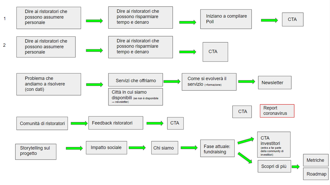
In normal times, we would have filled a wall with post-its, and end up washing our hands ten times to make the marker marks go away from our hands - but we were in lockdown, so we were already washing our hands enough, and chose to rely on Miro as the chosen tool for user flows.
We started writing down the steps a user would have taken, and behind we listed the options she had for every step. We changed them, recombined them, gathered them on different macro-steps, and then presented them to Giulia. She gave some feasibility comments, so we added, for example, the "Ask if the journeys are available" step, because there was still some manual work required inside our ideal flow. After that, we stepped into the most fun part...
Wireframes
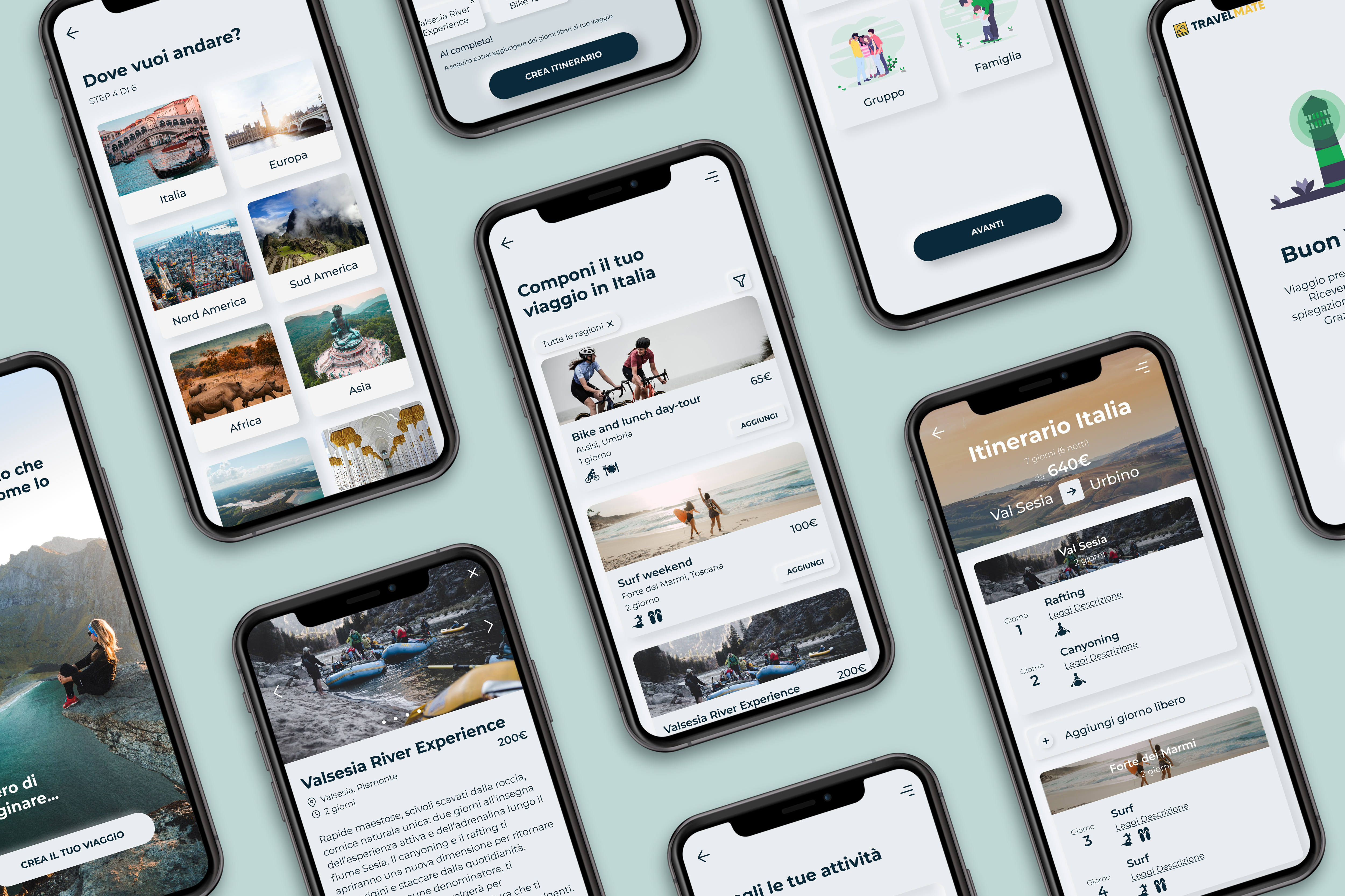
We thank coffee for this. I won't add much, just that due to the short amount of time, we recruited one fellow developer to quickly test the wireframes before applying the visual styles onto the screens. We found out that we made some errors, like not labeling the "quantified experience in one sport" right. We changed the range labels "Small experience / experienced" to "First time / Coach" so to make it less difficult for the user to define its true skill level.
Visual design
On the initial brief session, Giulia had been clear on wanting their font and brand colors applied to the prototype, because it would later be implemented into their existing website. To be honest, Francesca and I weren't thrilled by them. We found their green and blue a bit old-fashioned, even if they were coherent with the business. We were scared that having big grass-green buttons with a flat style would have looked outdated. We wanted to reduce the colored elements in the UI and yet keep it contemporary. After some mood boarding, we decided to use the neumorphic (or soft UI) style. Its concept consists of mimicking the Z-dimension with inner and outer shadows, and gradients. This lead to a very clean look that led the eye to the landscapes' images.


.svg)


.svg)